Justin Papaleo
Pizza & Pedals
/24

The Problem
how do you combine two very different products into an identity that feels alive and unique. I needed to think about how the type, colors, and overall direction of this brand was going to feel, what emotions I wanted to evoke. I felt the need to design pizza boxes, napkins, advertisements.

Process
The visual identity combines bold typography, warm pizza-inspired colors, and sleek cycling elements. A strong, adaptable logo is essential. something that looks just as good on a pizza box as it does on a bike jersey.
Researching various pizza and bike shops separately to get an idea for common colors, symbols, and visual systems. then mind-mapping various adjectives to describe what I saw and what I wanted for this identity
Rapid sketching to get ideas down on paper for logomarks and logotypes that could work until I landed on something that I felt used negative space to relay my ideas.
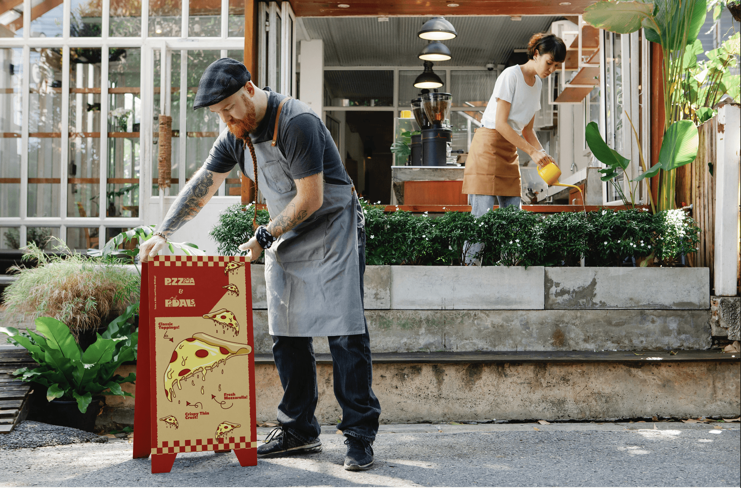
the final step to make the brand feel alive is the assets around the logotype. an identity is not just a logo, but what it does and how it lives in space. I made mockups and designed pizza boxes as well as advertisements to make the brand feel alive.
Solution
At its core, this brand should become a hub for local riders, food lovers, and curious newcomers. Hosting group rides, pizza nights, and repair workshops helps build loyalty and buzz. The identity isn’t just built in a studio—it grows with the community.

Outcome
This project ended up being my most ambitious to this point, and I proved to myself that I could take something never before done and make it into a strong identity. This challenged me to think more critically, and I made something that could really exist.